Total Views

Wednesday, February 19, 2025

The Art of Quality: Why Materials Matter

For over 20 years, I’ve painted with student-grade off brands and Liquitex acrylics, prioritizing affordability over professional brands like Winsor & Newton, Golden, or Grumbacher. While cost was my main concern, I never really questioned whether higher-quality materials could enhance my work.  

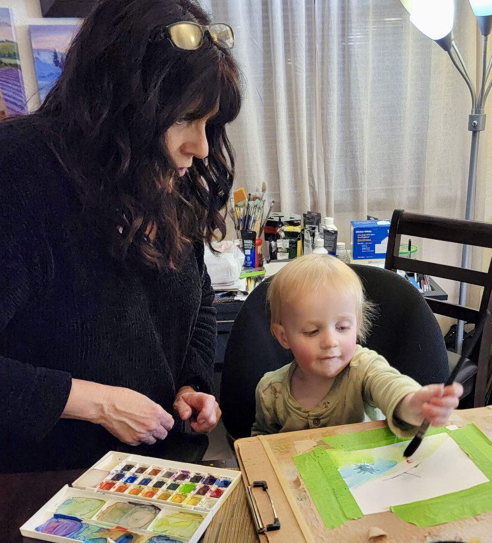
As a dedicated artist striving to improve, I’ve experimented with various mediums—charcoal, watercolor pencils, oils, and most recently, watercolors. Learning has always been my driving force, and I’ve spent countless hours reading books and watching YouTube tutorials. One recurring theme, especially in watercolor discussions, stood out: the crucial role of quality supplies.

Curious but not ready to invest in professional-grade products, I upgraded to a mid-tier watercolor set—Koi Watercolors—along with 100% cotton paper. The difference was immediate. The colors were richer, the application smoother, and the overall experience more enjoyable. It left me wondering: Why hadn’t I upgraded my other mediums sooner?  

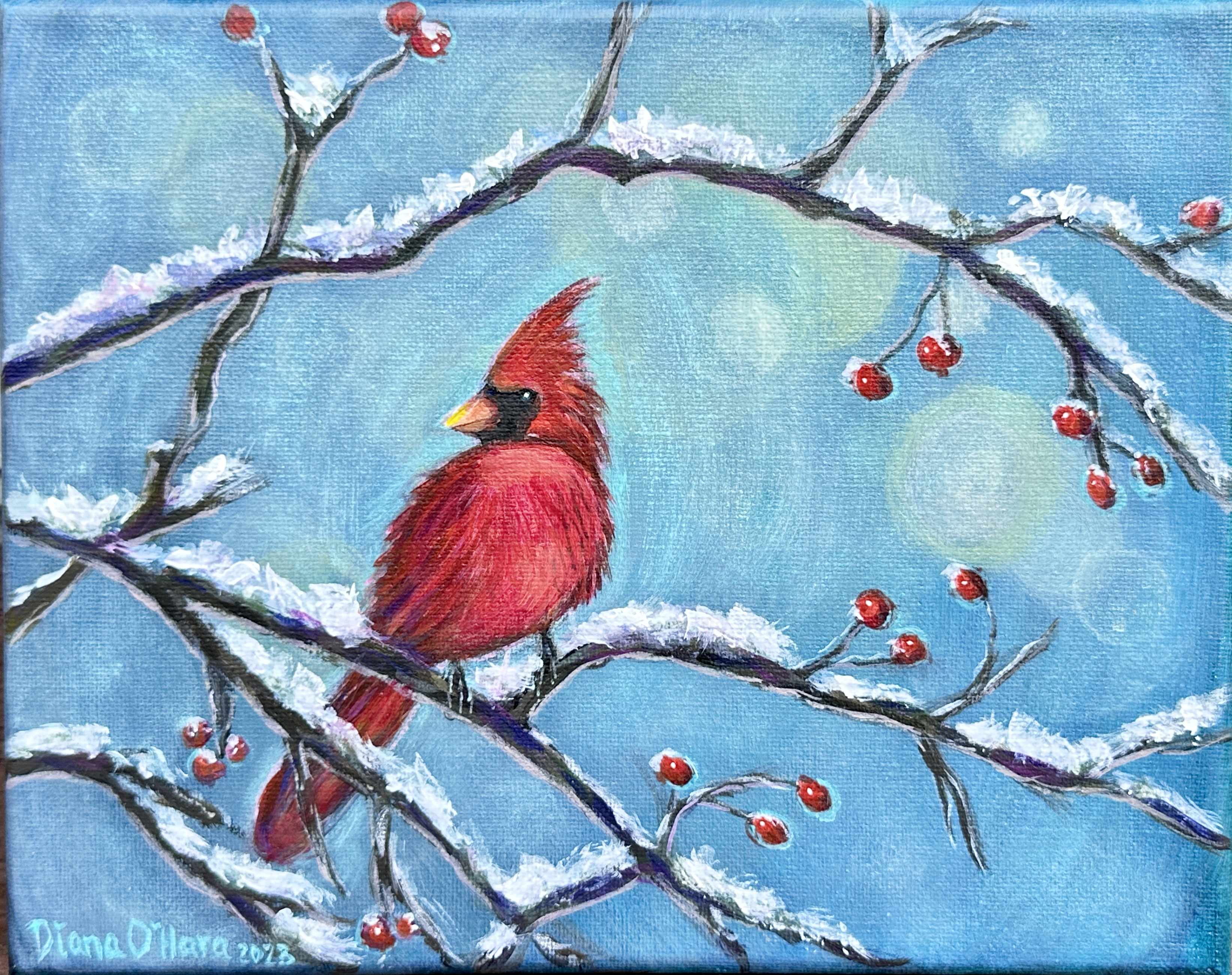
Does better quality really matter? Absolutely. Professional-grade paints, paper, and brushes respond more effectively, allowing for greater control and improved results. While skill develops with practice, using the right materials can elevate an artist’s potential in ways budget options simply can’t.


Monday, February 17, 2025

Watercolor Painting With Children

One of the joys of working with the young is their pure joy, enthusiasm and creativity. I am often fascinated with how fast the littles take to painting. My youngest grandson loved his new experience at working with watercolor. I did have to guide his hand and brush slightly. Otherwise, my dining room would begin to look like a Pollock. 

Note: My watercolor palette (Master’s Touch) is non-toxic to children. For children under age 10: recommended to having an adult overseeing craft or painting activities. 


Watercolor Greeting Cards

This year I have made several varieties of greeting cards. Recently, I have been practicing with watercolor paints. Below are several examples I have made. Instead of buying expensive store bought cards. I decided to make my grandson’s each a card based on a theme or characters they like.


Get creative and personalize each card.
*Grandma, would move icebergs for you*

This one is for my Titanic obsessed grandson 


Sunday, January 26, 2025

Kelp Painting Cont

Actually, I’ve never been scuba diving in my life. I can only imagine the breathtaking beauty of the ocean coming to life beneath the surface.  

Painting a seascape is my way of immersing myself in that world—a way to explore its wonder and magic without ever leaving dry land. For now, this is as close as I plan on getting, and that’s more than enough for me.

My inspiration comes from online photos of kelp beds. I may decide to add marine life or a mythical creature such as a Mermaid. I have to figure out the kelp first. 


Painting kelp is a first for me. The colors have been a challenge. I have used several mixing formulas of violet, orange, cobalt teal, crimson red, burnt sienna, titanium white, and phthalocyanine blue. I will post more soon. 


Painting Kelp: Helps Winter Blues

 Beginning Phase

Adding Subject 
Since January is nearly over, I’ve found myself shifting into the mindset of warmer weather. One of my favorite ways to embrace summer is by heading to the beach. Unfortunately, living in the Midwest means the closest option is the river shoreline—far from ideal, especially after winter, with its lingering smells of chemicals and dead fish. Not exactly paradise.  

That’s why this is the perfect time to create an ocean scene on canvas. Above is the start of my newest painting, inspired by where I’d love to be right now: scuba diving through an amber forest of golden, flowing kelp beds, where fish gracefully dance in the turquoise depths. Absolute heaven! Stay tune for the finish.

Saturday, January 18, 2025

Painting Winter Scenes

These snow-themed paintings showcase the variety of colors that can capture the essence of snow—ranging from blues, violets, and grays, to greens and browns—each offering a unique perspective of a snowy landscape.

As I've discussed in previous posts, painting snow is as much about patience and practice as it is about achieving the level of accuracy you find satisfying. For me, the goal is realism, though I often feel I fall short. My style leans toward a craft-like approach, but I continually refine my techniques to achieve a more realistic application.

For beginners, it can be overwhelming to follow expert tutorials focused on realism, especially when you're just looking for something fun and accessible. Personally, I find that keeping the process enjoyable makes learning much more rewarding.

What I love most about this process is how it allows me to learn by recreating, which ultimately helps me create something even better with each project. It has been invaluable in refining my skills and deepening my understanding of the medium.


Gnome In Snow

This playful painting of Gnome Santa was created quickly but turned out to be a charming addition to my snow collection. It also made a delightful Christmas gift!


The Painting That Waited

Happy New Year! After a five-month hiatus, I’m thrilled to share what I’ve been working on since my last post in August 2025. Below is a pai...