Total Views
Sunday, November 13, 2011
Glazing
I believe it helped and I will continue putting several more glazes on hoping it will accomplish what I want!
Will I ever finish...
Another layer added and many more after that. I was not liking the color of my darkest shadow. So I painted over again and again. I also darkened the eyes then lightened them again.
The green background was not doing it for me. I decided to painted over it.
After much frustration, I finally had to put this project to rest in order to come back later with fresh eyes.
Friday, September 30, 2011
Portrait Painting Progress
Thursday, September 1, 2011
The Layering Continues
As the last layer dried it looked a little chalky. I went in and added more warmth and deepened my shadows with a cooler tone.
There is much I have to learn before my painting can be considered "realism"... practice, practice, practice!
I will continue posting my transitions as I complete them.
Hair
Creating the Hair and Highlights
I began by mixing burnt sienna, yellow ochre, and ultramarine blue to build the base tones of the hair. From there, I layered in the highlights, letting lighter strokes sit softly over the darker foundation.
Hair takes practice—and then more practice—because its believability comes from multiple layers, even in a piece that isn’t fully realistic. This painting isn’t meant to look photographic, but I still wanted the hair to lean toward realism. To push it in that direction, I etched fine strands around the hairline, adding just enough detail to suggest texture and movement while keeping the overall style painterly.
| Color block sections |
![]() |
| Add lights for dimension |
Wednesday, August 31, 2011
Eyes
When I first began my painting the subject's eyes followed me from right to left. Since that time something happened and I lost it.
One of the things I do along my painting journey is photograph each step. It allows me to go back and see what I liked and disliked. Unfortunately, painting does not allow me to select the undo tab and go back. But having past photos of my work can offer insite of what I may have done wrong so that I can fix my "happy mistake"!
Oily Face
As you can see oil creates a smoother finish on the subject's face. The next several stages will be adding one layer at a time. Hopefully, with each layer the portrait will become more realistic. At least that is my goal.
One of the things I anticipate along the way our little mistakes and as Bob Ross states, They are "Happy Mistakes"! Got to love that guy, God rest his soul!
| First layer of oil |
The Process
This time, I decided to try something a little different. I’d been reading that acrylics can work beautifully for an underpainting beneath oil paints, so I figured—why not? In my last oil portrait, I used oils from start to finish, including the underpainting, and it felt like I was waiting ages for each layer to dry. And since patience has never been my strongest virtue, I was ready for a better way.
| Acrylic paints were used to begin the under painting process |
| And continued with acrylic until everything was covered |
Oil Painting Of My Daughter
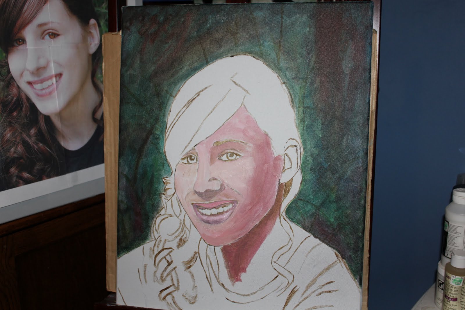
My daughter will be graduating next summer, and one of the things she asked for was a portrait painting—something personal and handmade to mark this milestone.
I started by taking several photos of her near our pond. A full-frontal shot didn’t feel right for the portrait I had in mind. Instead, a slight profile caught my eye. That angle offered richer shadows and a more interesting play of light—perfect for bringing depth into the painting.
Before transferring anything to canvas, I brought the photo into Photoshop. I enhanced the colors in her hair and skin and made her eyes a little more vivid, giving the reference image the life I plan to capture in paint.
To make sure the proportions stayed accurate—and to save a lot of time—I printed the reference as four separate 8×10 images and pieced them together like a puzzle. My canvas for this project is 16×20, so this method helped me scale everything precisely.
I love to sketch, but I’m not as accurate as I’d like to be. Some artists consider tracing or projecting an image “cheating,” but I see it as a practical tool. In the future, I’d love to invest in a projector so I don’t have to keep cutting, taping, and assembling large photo grids just to get the right image. Efficiency lets me put more energy into the actual painting—where the real magic happens.
| Sketch on a 16x20 canvas |
| Four 8x10 photos stitched |
Tuesday, August 30, 2011
Window Cats
| Beginning the under painting |
![]() |
| 14X18 "Window Cats" |
| In memory of Miss Tabby and Miss Molly |
Monday, August 29, 2011
Sky Scapes and Light Houses Continued
![]() |
| 5x7 "Light Willow |
![]() |
| 5x7 "Light Moon" |
![]() |
| 5x7 "Light Rocks" |
After painting these four sky scapes and light houses I discovered I was ready to go back to a large canvas. I had thought the detailing would be easier since it was smaller in scale but actually it was much more difficult than I had expected. Although, it was another great learning experiance! On to my next project...

Wednesday, April 20, 2011
Finished Painting Of "Passage Into Palisade"
![]() |
| "Passage Into Palisade" Completed Painting 18x24 Acrylic |
A couple years ago my family and I went to explore the beautiful Mississippi Palisade Park. I had taken several pictures while there of my family and some landscape photos. But this particular picture of my daughter using her cell phone to snap a quick picture was interesting to me. At the time, my daughter did not want her photo taken but I did anyway...one of her back! Once home and downloaded to my computer I thought the picture on the back of her t-shirt was just as interesting as the background of the surrounding park. It inspired me to want to paint a picture within a picture.
Enhancing Folds And Lettering
![]() |
| Enhancing folds and lettering |
At this stage, I wanted to give more depth to the t-shirt. First, I enhanced the folds by using a lighter shade of blue gray for the darkest part of the folds. Then I mixed various shades of white mixed with gray for the lightest part of the folds. Once the folds were complete I focused on the lettering. I mixed a combination of orange, burnt umber, Payne's gray, and white until I was satisfied with the end result. When mixing the paint for the folds and lettering I watered down the acyclic paint until the consistency was similar to watercolor. I applied several thin applications until the lettering began to take shape and color was where I wanted it to be.
Adding darker values to the background
![]() |
| Continue adding darker layers |
As I continued adding darker values I noticed my painting was not looking like I wanted. The more color I used in the background for the distant trees became to close and crisp. So I decided to do a wash of white mixed with water and painted over the background. At first, I was not sure this would work but after the painting dried it appeared further away and that is what I wanted. However, it was not exactly what I wanted, so I continued experimenting with different colored washes until I found one that worked. However, I believe it was culmination of colors that made the end result.
Tuesday, April 19, 2011
Opposite Colors Attract Interest
![]() |
The beginning of "Passage Into Palisades" |
The Beginning Of "Passage Into Palisades"
![]() |
| Image outline |
| (Fig. 2) |
Thursday, March 17, 2011
Wednesday, March 16, 2011
What's Next...

Saturday, February 26, 2011
Castle and Dragons
Castle and Dragons was created for my son who enjoys these magnificent fictional creatures. I wanted to use as few colors as possible to invoke a mystical theme. Most my other paintings I use many colors and variation of hues. The picture I used as my inspiration was done mostly in different tones of grey with hints of blue, black or charcoal. For my painting I used purple,ultramarine blue, process cyan, cobalt teal, paynes grey, raw umber, burnt sienna, orange, yellow ochre, black and white. I was happy with my finished piece considering this was my first attempt with a more monochromatic feel. I would have liked my painting better if it looked more realistic! I keep telling myself the more practice painting different subjects I will eventually find my "it" factor...until then practice, practice, practice and learning patience along my painting journey.
![]() |
| Sketch and mask |
![]() |
| Used deep and light purple for the under painting before adding different hues of grey and blue. |
![]() |
| Remove masking paint |
![]() |
| Grey and blue blended too much with the sky. |
![]() |
| Used orange for an under painting. Liked the affect but it was not what I wanted. But interesting! |
![]() |
Then I used a mix of Raw Umber
and Colbalt Teal
|
Sunday, January 16, 2011
Gifting!
![]() |
| Saw Blade had been previously painted by another artist, however, the pasture was missing something. So my friend wanted me to add the horses to give more interest to the foreground. |
![]() |
| I used painters glue and iridescent paint to create more interest and texture. |
![]() |
| Added a personalized touch! |
Tuesday, January 11, 2011
Abstract "Mindless Spiral"
After I swirled the colors together I was not sure where to go next with this painting. I just kept adding deeper reds, oranges, and continued playing with different colors.
![]() |
| "Mindless Spiral" |
Finished! What I love about this painting is that it can be placed on the wall in any direction!
The Frog That Paints My Silence
A Pause in the Journey What does one do when moving forward feels impossible? For me, it came down to a choice: surrender to the weight of...
-
I have been waiting patiently for this painting to dry (which is the most difficult part of this process) before moving to the next layer o...
-
Enhancing folds and lettering At this stage, I wanted to give more depth to the t-shirt. First, I enhanced the folds by using a lighter shad...
-
Beginning of glazing application Beginning of self-portrait The only aspect of this painting that resonated with me was the dre...


